Week 1 - HTML & CSS
Introduction
This will be a “crash-course” on HTML and CSS. Raw HTML and CSS are rarely used in a modern web development stack, but they are the foundation of all web development.
Some anecdotes about software:
Programming is a tool; Engineering is the job.
Software Engineering is more about knowing how to solve a problem rather than immediately knowing the answer.
There won’t be traditional “tests” in this class; our focus will be on solving problems and understanding the tools we have available.
Additional Resources
W3Schools is a great reference for HTML, CSS and Basic Javascript
Playcode.io is an online tool for quickly testing basic HTML/CSS/Javascript concepts.
HTML
If we think about a website like a house:
HTML is the foundation and framing
[to be continued…]
Comments
HTML comments are probably the worst possible type of comment to manually type
<!-- This is a comment -->
<!-- Comments can be multiple lines
And will also comment out code
<p>Like this paragraph</p>
-->
<p>Back to real content</p>
Structure
HTML is roughly structured as an XML document (slightly more relaxed syntax parser)
An HTML element is usually defined by a start tag, optionally some content, and an end tag
<p>
  This is a paragraph
</p>
Some elements don’t have a closing “tag”, such as “break”
<div>Some words</div>
<!-- "br" is a break tag, adding some space between these divs -->
<br />
<div>Some more words</div>
Structural Elements
Some special elements are used to define the structure of an HTML document.
html- This is the root element that wraps around all other HTML content.head- This element contains meta-information about the document, such as the title.- Several elements are often included in the
headtag (although it’s not required to set these insidehead):title- This element is used to define a title for the document. This is what shows in the browser tab.meta- This element is used to define metadata about the document, such as author, description, etc.link- This element is used to link external resources to the document, such as CSS stylesheets.style- This element is used to define internal styles for the document.script- This element is used to link external JavaScript resources for the document.
- Several elements are often included in the
body- This element contains the content of the document, such as text, images, links, etc. Usually, anything a user sees on the page is here.footer- This element is used to define a footer for the document. This is often used to include copyright information, contact information, etc.
Full Tag list
The full list of possible HTML tags can be found here: https://www.w3schools.com/tags/
Refer to this reference often when you’re not sure how to do something.
Common layout tags:
div- “Division” tag, used to divide sections of a page. This is by far the most commonly used tag. Think about it as a general “wrapper” for content.p- “Paragraph” tag, used to divide chunks of text into paragraphsinput- “Input” tag, used for accepting user inputform- “Form” tag, used to group input fields togethertable- “Table” tag, used to display tabular datathead/tbody- Defines the Table Sectionstr- Defines a table row within a table head/bodyth- “Table Header” tag, used to define a “header cell” in a tabletd- “Table Data” tag, used to define a cell in a table
Common content tags:
a- “Anchor” tag, used for linksh1,h2,h3,h4,h5,h6- “Heading” tags, produces larger text according to your stylesimg- “Image” tagul- “Unordered List”b- Bold the text between the tagsi- Italicize the text between the tags
Attributes / “Props”
Attributes, or “props” as we will call them later when we make our own elements, modify how each element functions.
<!-- no size limit -->
<img src="/path/to/an/img.jpg" />

<!-- set image width, setting height from the aspect ratio -->
<img src="/path/to/an/img.jpg" width="500" />

<!-- set the image height and width, ignoring the aspect ratio -->
<img src="/path/to/an/img.jpg" width="500" height="500" />
Some elements have required props, an “anchor” tag (<a>) requires an href attribute (which makes it a link).
<a href="https://www.google.com">Google</a>CSS
HTML Elements are styled using Cascading Style Sheets, or CSS. If we think about a website like a house:
HTML is the foundation and framing
CSS is the paint and design
[to be continued…]
CSS is applied to elements using the following hierarchy:
- Any styles with
!importantapplied - Inline styles -
style=attribute - Most specific selectors
#idselectors.classselectorselementselectors- Universal selectors (
*), combinators (+,>,~,space), and negation pseudo-class (:not())
Style Attribute
The style attribute can be used to apply styles directly to an element. Example:
<div style="background-color: red; color: white;">
    This is a div with a red background and white text.
</div>
This is generally considered bad practice, it’s hard to maintain and doesn’t separate content from style.
Class Attribute
The class attribute applies a “class” to an element. CSS Classes are a bit like an “alias” for a bunch of styles.
CSS Classes can be defined in <style> tags or in linked stylesheets.
When defining a CSS class, the class name must be prefixed with ., but the . is not used in the HTML markup.
<style>
  .my-favorite-div {
      background-color: red;
      color: white;
  }
</style>

<div class="my-favorite-div">
    This is a div with a red background and white text.
</div>
Specifying a class that doesn’t exist will do nothing, including no errors or warnings.
To debug if a class is being applied or overridden, the browsers developer tools are your friend.
Linking Stylesheets
Stylesheets are loaded using the <link rel=stylesheet> tag.
Stylesheets can override each other. Typically, the winning stylesheet is whatever loaded last, but this probably isn’t dependable.
Syntax and Selectors
The primary types of selectors are:
- class:
.thing - ID:
#thing - element:
div - Psuedo:
:first-child
There are many combinations of selectors: https://www.w3schools.com/cssref/css_selectors.php
Pseudo Elements
Pseudo Elements are powerful, more details about each: https://developer.mozilla.org/en-US/docs/Web/CSS/Pseudo-elements
A couple of the most common examples:
::after and ::before
::before and ::after can add “text” (or any unicode) content before or after an element.
Note that this content:
- Is not accessible to screen readers
- Can not be selected or copy-pasted
- This can be useful for visual elements that shouldn’t be copied when the user wants to copy-paste the data elsewhere, like a bullet icon or code line number
::nth-child() / ::nth-of-type()
Select the “Nth” element - Ex, the “2nd” or “13th”.
These support special keywords even and odd for selecting every other element.
Playcode sample:
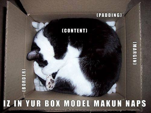
Box Model
A box is composed of four parts:
- The content area defined by content edges in four sides.
- A padding area, surrounding the content area and defined by padding edges.
- The border area, surrounding the padding area and defined by border edges.
- A margin area that defines the space between neighboring elements.
Borders
Borders are applied outside the padding area, but inside the margin area. This is important to remember! Padding and Margin will probably be the most used CSS items in this class.
Sometimes styles need to be combined to have an effect.

```css
/* This has no effect on it's own, because the border doesn't exist */
.card {
    border-color: red;
}
/* It must be combined with a border-style to have an effect */
.card {
border-color: red;
border-style: solid;
}Many CSS complex styles have a “shorthand” syntax
We can see the border shorthand here: https://www.w3schools.com/css/css_border_shorthand.asp
border: 5px solid red;Visual Formatting Model
Official standard describing how a page is laid out. More details at this link, but the details aren’t terribly important
https://developer.mozilla.org/en-US/docs/Web/CSS/Visual_formatting_model#box_generation
Position
Mozilla’s docs & demo covers this well.
https://developer.mozilla.org/en-US/docs/Web/CSS/position
Viewport
The Viewport is the area of the screen displayed to the user. You can set element height or width as a percentage of the viewport with vh and vw.
<div style="height: 100vh; width: 100vw; background-color: cyan"></div>Caveat: This often results in being slightly larger than you want. Sometimes useful for the outer-most container, like the body tag.
z-index
Determines what elements display on-top of one another. A higher value means higher priority. This is useful for things like a drop-down menu
A real z-index bug I ran into recently for NCAE Cyber Games:
What is should look like:
Float
Float allows other elements to float around element.
Animations
CSS has some cool animation options. We won’t be using them in this class, but it’s important to know they exist:
https://www.w3schools.com/css/css3_animations.asp
Modern Layout Engines - Flexbox & Grid
Generally, the best way to get to know these is to use them. css-tricks.com has awesome reference sheets for each.
To an extent, neither is “better”, and usage often comes down to personal preference - but both have specific use cases where they shine.
Both can be debugged by clicking the flex or grid badge next to a parent element with display: flex/grid set.
Flexbox
https://css-tricks.com/snippets/css/a-guide-to-flexbox/
Generates layout more “dynamically”
Best used for:
- Elements of varying size can flow within
- Elements that should dynamically grow/shrink, but aren’t required to be in alignment with each other in all directions
Example
Grid
https://css-tricks.com/snippets/css/complete-guide-grid/
Creates a grid with defined columns on the page.
Best used for:
- Elements that need to be in alignment in all directions and are of a flexible size
- Elements should take entire container
Example
Responsive Design
According to MobiLoud, Mobile users makes up 57.8% of global internet traffic, followed by 40.16% on Desktop and 2.04% on tablets.
Each of these users have different design requirements to make an awesome user experience.
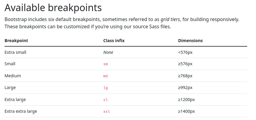
Generally, @media breakpoints are used to create responsive designs: @media (max-width: 600px).
https://www.w3schools.com/cssref/css3_pr_mediaquery.php
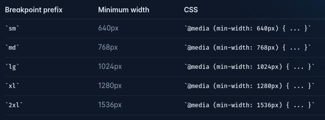
Typically, these break points are defined by the CSS framework you’re using.
Bootstrap:
Tailwind:
CSS Preprocessors
SASS / SCSS - Syntastically Awesome Style Sheets
Allows for variables, conditionals, nested definitions, extending other rules, and more.
Variables example: https://getbootstrap.com/docs/5.0/customize/color/#color-sass-maps
// Breakpoint mixin
@mixin breakpoint($size) {
  @if $size == 'small' {
    @media (max-width: 600px) { @content; }
  } @else if $size == 'medium' {
    @media (max-width: 900px) { @content; }
  } @else if $size == 'large' {
    @media (max-width: 1200px) { @content; }
  }
}

// Placeholder selector for button
%button-base {
  padding: 0.5em 1em;
  border: none;
  cursor: pointer;
  &:hover {
    opacity: 0.8;
  }
}

// Using the breakpoint mixin with @include
.my-container {
  @include flex-container(column, space-between); // previously defined mixin

  .nested-item {
    color: blue;
    &:hover {
      color: darkblue;
    }

    // Include breakpoint mixin for responsive font size
    @include breakpoint('small') {
      font-size: 12px;
    }
    @include breakpoint('medium') {
      font-size: 14px;
    }
  }

  .my-button {
    @extend %button-base; // extending the placeholder
    background-color: green;
    &:active {
      transform: scale(0.95);
    }

    // Include breakpoint mixin for responsive padding
    @include breakpoint('small') {
      padding: 0.25em 0.5em;
    }
  }
}